Standen House near East Grinstead was the home of a successful Birmingham solicitor and his family. It was their country retreat from the end of the 19th century after they had moved to the hustle and bustle of London. Today it is preserved and managed by the National Trust and we saw it displayed as if the family were in residence in the summer of 1925 and had just left for a picnic. Friends have visited it at Christmas and seen it bedecked with mistletoe and holly. Either way, the homely charm of the place is unmissable.
Standen is a fine example of an Arts and Crafts movement house. Its architect was Philip Webb and its interiors were created by Morris & Co, the company that William Morris started with Webb (and others). The house remained the home of the Beale family and their descendants until 1972 when the National Trust took it under their wing.


Philip Webb’s last major project
Externally, one first notices the variety of materials that Webb made use of: locally-made brick in multiple shades of red, ochreous pebble-dash, Sussex-style tile-hung shingles, weatherboarding, Portland stone and local sandstone. The south façade is endlessly interesting with its varied roofscape: the strong verticals of its chimneys, the row of five shade-giving, sharp, triangular gables, the solid belvedere tower on the east end balanced by the long conservatory with its four deeply-set arched windows snugly up against its summer house at the west end of things. Five gables balanced by four arches. It has undoubted solidity but without symmetrical pretention. This is the side of the house that enjoys fine views south across the Ashdowne forest, but it’s not visible as you arrive down the winding lane.

On the northern side of the house, the wide, open farmyard gives access to an arched gatehouse under which one passes to reach the front door through a deep porch. Here the design is less elaborate, unfussy and thoroughly unpretentious. The feel is intensely welcoming, of a house comfortably settled into its environment. This was Philip Webb’s last complete country house project. Apparently, it was one that he felt positive about in nearly every regard.
Much of Webb’s pleasure in having worked on Standen was probably due to the close relationship he developed with his clients, James and Margaret Beale and their three children. They collaborated on so many different aspects of the house with Webb being unusually attentive to his clients’ requirements. His contribution was more than that of an architect. He proposed planting schemes for the garden. He designed lights, finger plates and coat hooks. He advocated the display of blue and white china on the dining room’s green shelves. The youngest child, Helen, commissioned him to design her own playroom - for which she paid him sixpence. He listened to what style of wardrobe the eldest daughter, Amy, wanted in her bedroom. No surprise then that when Webb retired, he chose to live but 10 miles from the family’s country home.
Morris & Co, Webb’s collaborators
Webb was a co-founder of William Morris’ Morris & Co, the seminal design partnership that drove the Arts and Crafts movement. Much of their influence finds full fruition at Standen where wallpapers, fabrics and carpets complement Webb’s architecture. Margaret Beale was an expert needlewoman and with her three daughters they worked on many of the embroidery designs that Morris & Co provided for the house.

“Have nothing in your house that you do not know to be useful, or believe to be beautiful”, is William Morris’ most famous and inspirational quote. Standen House exemplifies this in every detail.
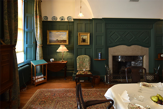
Arguably, the strongest contribution to this philosophy is the use of pale-coloured paint on the internal wood panelling. This broke from the fusty Victorian tradition of houses being internally sombre and provided a more neutral background against which vivid colours in fabrics and ornaments could stand out, be seen, noticed and appreciated more fully. This lightness also served to help make the grain in wood become more noticeable and interesting. Not much is merely functional.

Morris’ wallpapers seem to come alive when run up against off-white ceilings and woodwork. The vivid blues of slender vases and the interplay of blues and greens in decorative tiles are also electric when set against ivory-coloured panelling around a fireplace. Just remember how revolutionary this was at the time.

Note how this consistent use of off-white/ivory/oyster paint for the over-mantle wood panelling is offset by no two fireplaces or their panels being the same. Each room offers a variation on a theme. Each sports hexagons, triangles, rhombuses or squares canted at 45 degrees to work alongside the necessary horizontals and verticals of the fireplaces themselves.


Here’s the same design principle of a non-patterned, single-colour background, this time using deep green for the dining room’s dramatic high wainscot. (The portrait is of Sir Samuel Beale, 1881 - 1964, by Kenneth Green. See the link below to view other portraits by this artist.)

For this style of interior design, the plainer the background, the more elaborate the foreground could be. By the same token, the richer and more detailed the background, the less foreground decoration was needed to achieve the same effect. Plain panelling worked with richly-detailed wallpaper. Achieving a harmonious balance of these elements across the same space required skill, experience and that most personal of sensibilities - taste. Morris achieved this in his wallpapers by balancing colour with detail: the more there was of one, the less there could be of the other, as here with the staircase’s large-scale Acanthus paper.

A broader view
It’s easy to get swamped by detail at Standen. There is so much to see and if you are enthusiastic, one visit will probably not suffice. I’ve not mentioned anything here about what’s standing on shelves or hanging on walls (other than wallpaper). There is an extraordinary range of exquisite work by artists and potters whose contribution to the Arts and Crafts movement in their own right had a lasting impact. And there is the garden, a subject in its own right.
All of this comes into better focus on a visit to an equivalent country house decorated in a traditional ‘Victorian’ style. Think antimacassars and aspidistras: an overwhelming excess of sombre detail. Set against that, Standen House is a breath of fresh air.
… and then there’s white space
Designers talk about white space to refer to breathing space, often using a pale colour (but not necessarily) which leaves a generous gap, margin or boundary between separate design elements. This is particularly important in print and on the web. It’s a design style that eschews an excess of flourish and detail and allows well laid-out content to be foregrounded against a plain background (of any colour - it needn’t be white). There are aspects of Standen’s interior design that seem to have made good use of this principle of white space, the use of oyster white panelling being the most obvious.
Just to round off this footnote/digression, below are two examples of print and typography from the desk of William Morris. On the left, from 1896, is the Troilus and Criseyde illustration from the Kelmscott Chaucer. The illustration is by Burne-Jones and the border typography is by William Morris. There’s no white space here at all … or rather there is plenty of it in the sense that the text has wide margins: it’s just that those margins are tattooed towards solid black with a monochrome Morris design. In contrast, on the right is Printing by William Morris, reprinted by the Arts and Crafts period printers The Village Press in 1903. Plenty of unambiguous white space here.


I have digressed well beyond the limited brief I set myself here, and basing a line of reasoning on but two examples of print from amongst hundreds of others makes for an insubstantial argument. As a web designer who has a passion for using white space (not least because it gives due respect to my own clients’ content), it seems obvious to me that in the way that Philip Webb and William Morris employed their craftsmanship at Standen House, many of us working in design today owe a debt to this very special place and to the ideas that helped create it.
A follow-up visit
Two years on and Standen’s charm is not only undimmed but brighter. A small army of volunteers is passionate about the house’s upkeep and about presenting it to visitors. New pathways have been laid and the garden settles the house in its woodland surroundings with a maturity beyond its years. Bees and insects buzz in such numbers they seem to be bucking the trend. This was clearly the aim. Bravo.


I am sometimes ambivalent about the way in which The National Trust displays some of its properties. Fake scones and strawberries which await the family’s return test my tolerance but a vintage stapler settled beside a closed box of paper clips and an opened box of pencils - all of a correct and matching vintage - could be pure haiku. As Eliot had it: “Dust in the air suspended / Marks the place where a story ended”.

Links
Standen House and garden on the National Trust’s website.
Standen on Wikipedia.
The Arts and Crafts movement on Wikipedia.
William Morris on Wikipedia.
Philip Webb on Wikipedia.
More portraits by Kenneth Green.