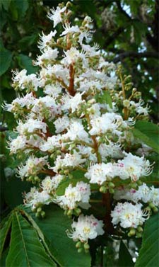
My workstation here in the Gers overlooks a magnificant horse-chestnut tree, aesculus hippocastanum (the conker variety, not the sweet chestnut one). It provides shade from the blasting sun and in April it transforms itself with countless bunches of pink-tinged white blossom. Bit by bit it etched itself on my imagination to the point where part of it had figuratively found purchase on the masthead on this website (in the 2010 and 2011 designs).
Inspiration is not always the starting point, but it helps

That it’s a chestnut tree leaf – or whatever – is not really the story here. Up there at the top of the page could be anything that serves as a logo or emblem. Instead, this is about the process of incorporating into a website design an image of something that ‘has significance’. It’s about branding and identity rather than trees or hoary old chestnuts. It relates equally to your business, whatever that might be.
The starting point, in January 2010, was that I wanted to incorporate something that satisfied the following criteria:
- it had to be ‘organic’, possibly natural, certainly not mechanical or technical: websites have technical connotations, so something that suggested the opposite of cogs, machines, code and propeller-headedness might do the trick;
- I had already decided to stick with green titles and headers, so an image that included green would probably be required;
- if it could relate to something ‘personal’, then more points would be scored.
Another idea was lurking, one about how a website plays a key role in the growth of a business. Acorns and oak trees were valid candidates, but they’d probably been done to death.
The right image
With anything to do with chestnut trees being the target, the next step was to find a suitable image. Trunk, bark, branch, twig, leaf, blossom or chestnut – or indeed the whole tree? This too was a decision with some pre-set criteria. Availability was the first one, but clarity and sharpness were equally important. As was the need not to have too much detail which would bulk out the image and make for slower page load.
It doesn’t take long with even a good camera to realise that this isn’t the way to go. I can probably drive Photoshop as well as the next man, but separating a foreground image from the background clutter is time-consuming in the extreme. Even shooting leaves against a white background introduces impossible amounts of unwanted shadow. Give it a try if you’re not sure!

It’s generally far better to spend time on iStockPhoto, specify photograph or illustration (the former in this case) and get searching. It’ll cost a bit but the resulting quality is well worth it. As well as searching for a chestnut leaf, I needed it to be ‘isolated’ preferably on a white background (something that you can specify very effectively on Shutterstock) so that I could manipulate it against any other background. This is a really important stage in working up design ideas for clients and it pays to be discerning. If you choose an image that you can cleanly separate from its background, then you can replace the background with anything and also apply edge effects (such as shadows) as required.
Several hours poking about on iStockPhoto eventually located various candidates, amongst which was the one, above, that finally made the grade. It came in a wide range of file formats and sizes, but a medium jpeg was fine, about a 1.5Mb file size around 1,500 pixels across. The image quality was good enough to require no additional editing and certainly no fiddly removal of background detail.
The breakout image or the border breakout effect
Print designers and web designers spend some of their time thinking in rectangles. Pages, columns, blocks, boxes, headers, footers – all these are rectangular. It’s often nice to apply a bit of softness to these, to break a rule, to puncture a border, break a boundary, trespass across a margin or intrude into an adjacent area.
This is variably called a breakout image or a border breakout effect. I’ve used this effect for several clients and reckoned it was time to use it on my own site. This carefully-sourced chestnut leaf had plenty of potential for being used in this way.

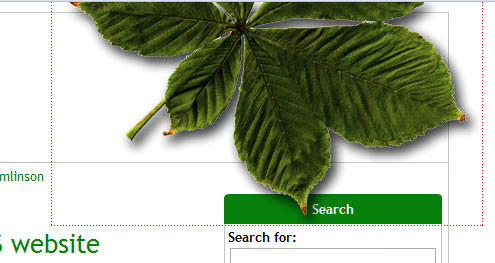
For its first run it needed to work against a plain white background where the site’s content-rectangle had a 1-pixel grey border, with a second 1-pixel border between the header and the content below. It over-runs the right-hand edge of the content-rectangle, floating off into open space. For good measure, it also spills down onto the caption of the search panel. The floating image is shown here with dotted red borders. Everything outside this rectangle is the rest of the web page.
The hardest bit is to ensure that everything that lies under the rectangular area of the floating leaf is included in the image of the leaf itself (including the green caption to the search panel). This image then needs to be floated in its own div (loading after everything else has loaded), slotting it into place exactly.

For the current (summer 2011) design, the leaf sits on a coloured background but is also required to straddle the charcoal navigation bar and just poke out beyond it onto the white page. This one required two different images, stitched together by the browser, shown here with a white line indicating the ‘join’.
The CSS3 complication
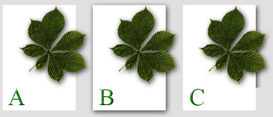
There’s one final twist to this back story. To some tastes, it would be just right to have this leaf (or whatever the visual motif is) pushing out beyond the edge of the content-container itself. That works really well if the container hasn’t been assigned a drop-shadow courtesy of CSS3 (as in A below).

Containers used to get drop-shadows through the display of laboriously prepared images that were hosed into place as background images. Breakout images therefore had to incorporate bits of these drop-shadows and it would work well (as in B above). When CSS3 came along, these subtle drop-shadows could be applied to content-containers in code, making for a lighter and faster-loading solution. Unfortunately, with CSS3 drop-shadows not displaying in all browsers, it means that such shadows can’t be included in the breakout image because they might exist only there and nowhere else (as in C above). So with CSS3 the breakout has to stay inside the content rectangle if the latter uses CSS3 drop-shadows.

Even with this minor limitation, breakout images can help loosen the rectangles that web design holds together and presents some striking possibilities in giving a business some visual distinction on the web.
Mine’s a chestnut leaf. What would your breakout image be?
Footnote: the CSS drop-shadow( ) filter
Time has marched on and now (early 2018) we can achieve many of these results with far greater ease courtesy of the CSS drop-shadow( ) filter function. This works on transparent PNG images where you want a part of the image to be given a drop-shadow. To demonstrate this I’ve used the familiar chestnut image. It’s a rectangular PNG file that has transparent pixels where there are no leaf pixels, shown twice below with a narrow, dotted red border:

What you see above is the ‘unadulterated’ image with no other visual effects applied than the dotted red border. We then re-use the same image, below, and apply CSS styling to it to request that the browser applies a drop-shadow effect inside the image around the edges of the leaf, as follows:
filter: drop-shadow(0px 0px 12px rgba(0,0,0,.8));This requests the browser to display a 12 pixel black drop-shadow where the white pixels of the image run up along the edges of the leaf. (The .8 function of the code defines an ‘80% of black’ colour for the darkest part of the shadow gradient.)

I’ve placed the leaf image against a blue-to-white gradient so that you can scroll/swipe the image horizontally and watch how the drop-shadow takes account of what’s behind the image. Now the browser can deliver the breakout effect with sufficient (although perhaps not perfect) precision, with much less labour on the part of the designer - to cater better for flexible design layouts that need to squeeze themselves into any and all screen sizes out there. (This effect is supported, at the time of writing, by all browsers except Opera Mini and IE.)
