Rants don’t usually contain reasoned explanations. Although this may sound like one, it therefore isn’t - as you will see. The BBC Sounds app (for Android) is so unfit for purpose that one reviewer on Google Play described it as “a gigantic steaming Turd of an app”. The capital T is nice - and made me wonder whether “Turd” is the “true name” of the BBC Sounds app, perhaps in the manner of Hebrew and Egyptian proper names - and Ursula K. Le Guin’s exquisite Earthsea trilogy - where only when you know something’s true name can you bend it to your will. Naming and shaming rolled into one. I know enough about software to see where that would end and, besides, I’d need to continue this post by using “Turd” instead of “BBC Sounds”, which I’m not too taken by. But that capital T formalises the disdain and frustration felt by the writer of that review and he is not alone. Clearly many others have struggled. In fact, 17,593 users have been moved to leave their reviews on Google Play, scoring a dismally average 2.7 star rating at the time of writing. Not bad for a one-man-and-a-dog web-shop, but appalling for this country’s national broadcaster.
[This post was published on 24th November 2019. A week later I was contacted in a personal capacity by a BBC senior software engineer working on the BBC Sounds project. He addressed each of the points I raised in this post. I have retained this post unchanged, but have added, below, some updates in the light of the comments that were made.]

One would need an iron constitution to work your way through all seventeen thousand of the reviews available - and maybe the developers themselves haven’t the courage for it either - so I’ll lay out my four major criticisms of the app based on my experience since it was foisted upon us as a replacement for the iPlayer Radio app in September. These are based on using the app on three different Android devices mostly for catch-up listening.
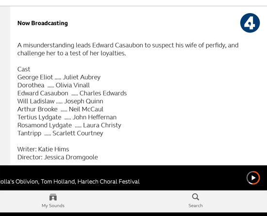
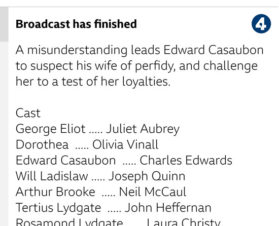
Familiarity may breed contempt in this case, but we first need to know the basics of the app’s catch-up screens. Thankfully, the principle is simple: select a station, scroll through its schedules, find the programme you want to listen to and play it. Here are the three screens users interact with:

Let’s step through each issue, referring to the screen names above.
1. No dark theme
Easy. The app is dazzlingly bright. It is a dramatic contrast with the iPlayer Radio app it replaced. The Beeb says it is “working on making a dark mode to the BBC Sounds app soon”. You can sign up to be notified when it’s done. Good, but the app should have shipped with this, don’t you think?
2. Small tap targets
Tap targets are touch-responsive ‘objects’ like buttons that users tap. The ones that bother me are the small black calendar icons on the Stations screen and the slightly smaller play icons on the Schedules screen. These diddly icons are somewhere in the region of 24-26 pixels square. They have no surrounding white space included in the tap zone. The black calendar is all there is for your finger to make contact with. Google themselves recommend the following:
Any on-screen element that someone can click, touch or otherwise interact with should be large enough for reliable interaction. Consider making sure these elements have a width and height of at least 48 dp, as described in the Material Design Accessibility guidelines.
A bit of nerdery is require to wrangle these numbers into meaningful shape. My five year-old Nexus 7 tablet has a screen dpi of 323dpi. Using the DP/PX converter provided by Pixplicity, these 24 pixel square calendar icons have a 12dp size, which is a mere one-sixteenth of what Google recommends Android software buttons should have. This explains why it takes me two or three finger stabs to correctly land on the calendar icon for a station’s schedule on the BBC Sounds’ Stations screen. They don’t just seem small; they run counter to what is the design advice for the Android OS. It’s not as if there isn’t enough space on screen for bigger calendar icons.
3. Too small font-sizing
On Android tablets (and iPads) you can adjust the font sizes displayed. This is an accessibility feature. Try doing that and see what effect it has on the BBC Sounds app. It inches the font size up a bit on the Stations and the Programmes screens but on the Programme screens, which can be text-heavy, the effect is minimal.

I’m not aware of an online tool that can tell me what size text in a screenshot is, so I’d have to guess this text (the detailed text, not the titles) as being somewhere between 10sp and 12sp. (The sp or scaleable pixel is the Android equivalent of a pt. Read more about this here. Read more about Android Mobile Typography Guidelines here.) These guidelines suggest paragraph text should be 14sp, which you’d be able to increase using your device’s inbuilt accessibility features. Even doing that on my Android devices, this text remains just too small to read comfortably on screen. It’s not too difficult to fix. TextView auto-sizing was introduced to the framework with Android 8.0 Oreo. Raising the value of the autoSizeMaxTextSize property would probably do it.
4. Haphazard scrolling
Selecting a station on the Stations screen or a programme on the Schedules screen requires scrolling. Both screens have an abundance of unused white space, but most of it is either dead space or badly-coded space. (In general, we like white space - which needn’t be white - because it often foregrounds the content and adds to its value. It helps a design ‘breathe’ rather than feel cramped. On apps that are driven by touch, this helps avoid mistakenly tapping the wrong target object.) But on these screens, where you start a scroll swipe is a major puzzle. It looks easy but, believe me, it is not!
On the Stations screen, you can’t scroll by starting your swipe on the grey borders, either left or right of the listing. That grey area is inert. Starting your swipe in the white zone between the large circular icons on the left and the small calendar icons on the right will be a haphazard affair. Sometimes the scroll will start, but most times it won’t.
On the Schedules screen, somewhat bizarrely there is no white into which you can start a scrolling swipe. The grey zone that contains individual programme details is another hit-or-miss zone. Sometimes a swiping gesture will gain traction and the page will scroll. Sometimes it won’t.
I think I’ve worked it out now - and I explain how to manage scrolling on these two screens below, under a screenshot marked with green arrows for your ideal scroll zones. (When the developers have fixed this, you can return to using the app intuitively without getting frustrated.)
But these mistakes are simply sloppy coding. Building stuff that works intuitively is hard work. The Android screen, like any other touchscreen, is controlled by an OS that knows the difference between a tap/touch and a gesture such as a swipe. The latter starts with a tap but the duration of the tap extends long enough for the finger to move away from its initial point of contact and become a gesture. Android provides a GestureDetector class which includes a group of events such as onDown(), onLongPress() and onFling() which help it work out what users are doing. The BBC Sounds app doesn’t seem to make great use of these. (Maybe Android should have provided an onTabletFling() event. Then if the BBC Sounds app was running when the tablet hit the wall, the app could call home and let the developers know what the user was trying to do. But I digress …)
A tap is a tap. End of. But when it’s a swipe, the screen should scroll. Instead, what actually happens is nothing. When I started using these screens, only about 25% of my scroll gestures resulted in a scroll. The rest did nothing. They didn’t result in an erroneous programme selection, which was something. But my scroll swipes still did nothing. I was wiping imaginary smudges off the screen, getting nowhere.
The Android developers have thought this through by providing an onInterceptTouchEvent() method. This gives a parent object the chance to see any touch event before its children do. In plain language, that means that the app has the ability to tell the difference between a tap on a programme’s title and a swipe gesture that starts on that title and is intended to scroll the programmes list. Bingo. If the developers of BBC Sounds had made use of this event in their code, users would have been able to start their scrolling anywhere on the screen, not just down these impossibly narrow scroll zones. In a sense, the screen knows whether the user is tapping or scrolling. It’s just that this app’s developers have not made use of that knowledge.

So until the developers fix this, scroll in the Stations screen using the very edges of the white central zone. In the Schedules screen scroll in the grey area outside the programme listings. The green arrows I’ve added to both these screenshots show you where scrolling works. Don’t waste time trying it anywhere else. The tragic thing about this is that it’s so counter-intuitive that it needs to be described. A better design would have just worked first time, no puzzling, no rants, no explanations.
Ignorance of prior experience
The really sad thing about this is that the BBC knows how to do all of this correctly. I draw your attention to two web pages. There’s a set of Mobile Accessibility Standards and Guidelines v1.0, dated 2014, that links to a BBC-branded page that no browser I know can properly display but whose source code has a 2017 date stamp, meaning it’s probably new enough to be very relevant. (Please don’t tell me that this glitch is why the BBC Sounds app is so bad!) Tragically, there is then a page entitled How to design for touch, which is brim-full of good advice which the developers of BBC Sounds might have benefited from being asked to read. Indeed, this corner of the Beeb’s website is glorious. It’s crammed with stuff worked up by their Global Experience Language department and the resources there are exquisite. I find no mention there of the BBC Sounds app and I’d say that GEL had nothing to do with the app whatsoever. (Anyone knowing otherwise, please contact me to put me right.) onHeadsRoll()!
A second look at the BBC Sounds app for Android
The following is my follow-up to comments that have been provided in a personal capacity by a senior software engineer working on the BBC Sounds app project who contacted me a week after I posted the above article. I am grateful to him for his measured response to my original post and offer the following by way of reply.
Concerning 2. Small tap targets
Apparently the hit areas I cited - the calendar icons on the Stations screen and the play icons on the Programmes screen are larger than I thought them to be. Contrary to what I said, they do include white space around them and this white space is part of the clickable tap target. Switching on the Show layout bounds option in the Drawing category of the Developer options section of Android’s Settings shows this to be the case. My gripe is therefore that the icon forming the CTA (control to action) is too small. That said, in my experience, some of these icons do not always respond to a tap. It looks as if something else is influencing the ability of these objects to register a tap. More work needed - and not just in increasing the visible size of the CTA.
Concerning 3. Too small font-sizing
I have been advised that the app’s text sizes should almost all be defined in sps (or scaleable pixels) and therefore should scale accordingly.Apparently, there may be situations where this may cause layout problems (and by inference will therefore not work?).
I have not wired a tablet up to a desktop running Android Studio’s Layout Inspector, as was suggested, but I have had a closer look at this on three different Android devices. On an Android 9 tablet which has eight font scaling sizes available in the Settings > Accessibility section, font scaling works perfectly, giving readable size text on these potentially dense programme screens. On an Android 7 phone which has four font scaling sizes available, this works well too. However, on an Android 6 tablet which has just the one Large fonts option, this works very poorly - and it was on this version where I first encountered the problem. To see this in action, here are the default font size version and then the larger font version on Android 6. These are screenshots of portions of these screens, so in the flesh these font sizes will appear smaller than they do here. These screenshots give an indication of relative font size only.


This might look like a reasonable degree of font scaling. However, compare it with the font scaling produced on an Android 9 device with its font scale set to the largest of eight available sizes:

I stand corrected in that the BBC Sounds app does scale its fonts nicely - but only sometimes. On Android 6 it is poor. The point here is NOT that the font scaling that I’d like to see with the BBC Sounds app can’t be done on an Android 6 device. It is that it could and should be done. This would stop the BBC Sounds app having (on these Programme screens) what might be the smallest font size known to an Android 6. It would also correct an issue that did NOT happen with the previous BBC iPlayer Radio app on that same device. (And, for clarity, the BBC Sounds app has a minimum system requirement of Android 5.)
Concerning 4. Haphazard scrolling
This is clearly a notty problem for the developers of the app. My correspondent suggested that some of this was tablet-specific and this may be the case. My attention has also been drawn to a factor called touch slop where the distinction between a vertical and a horizontal scroll is difficult to make. On checking this out, I see that no less an authority than MIT suggests that this is best dealt with by overriding the onInterceptTouchEvent() method, which was my original proposal above. The MIT coders have even provided a code snippet that starts with a private mTouchSlop integer declaration!
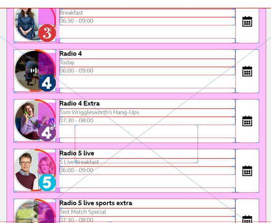
I still think that argument stands. It would be a cleaner way of addressing this issue than chasing it down the device-specific route. I can back that up with my non-scientific experience on my three trusty Android devices. In addition, by showing layout bounds, as suggested for verifying target hit areas above, I can see that non-inert areas of these screens that always respond well to a vertical scroll gesture appear to correspond well to areas left empty of other objects. These show up as magenta-shaded zones in the screenshots below. There is also some correspondence with my original green arrows, above. Poor scrolling, as originally identified, plagues both my Android tablets, but seems much less prevalent on my Android phone. (iPads seem to have none of these issues.)

If there’s any doubt about this, I suggest the developers try the following. Find a Samsung tablet equipped with one of their nice pens. These are lightweight beauties with a super-precise 0.7mm tip. Set the tablet to show the layout bounds and then go to work on the Stations screen of the BBC Sounds app. You can see exactly where the stylus tip lands on the screen and to be sure the pen activates a tiny circular cursor on the screen as you home in on the target. Now try vertical scrolling by starting the gesture in any of the magenta-coloured zones. You will probably find that these scroll gestures work flawlessly, 100% of the time. Now simulate being a standard user who is unaware of the foibles of the BBC Sounds app and start your gestures anywhere in the white zones. You should find a startlingly high proportion of inert gestures that produce no reaction in the app.
I would like to be confident that most of these issues with the BBC Sounds app for Android will eventually be solved. The scrolling one at the moment is the killer error. It happens on my Android tablets and is what makes this app a real steamer.
Update - April 2022
Hoorah! Version 2.7.0.16021 has been unleashed onto my Android devices and issue 4 Haphazard scrolling, above, has been fixed. I bet they used an override on the onInterceptTouchEvent() method. This was the killer error I first posted about in November 2019. Better late than never!
